Camper
Camping App
Open Figma Project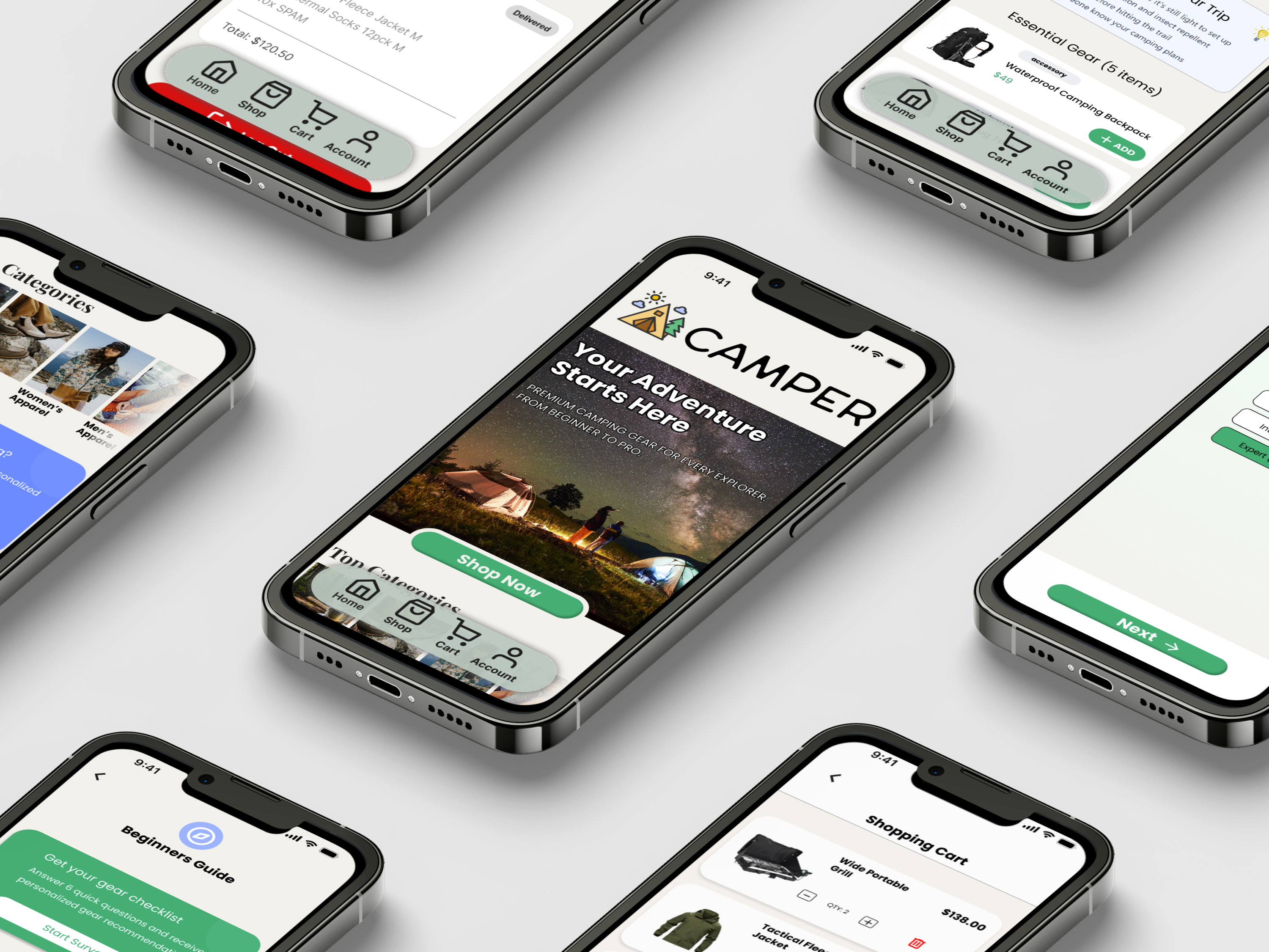
Project
End-to-End App
My role
UX/UI Designer
Timeline
4 weeks
Tools
Figma
Background
This project focuses on designing a mobile app that helps people plan and manage camping trips with confidence and ease. Camping can be an exciting experience, but for many users the process of preparing, organizing gear, choosing campsites, and understanding what to expect can feel overwhelming. At the same time, more experienced campers often want faster, more efficient tools that don’t slow them down with unnecessary complexity.
Problem
The challenge lies in balancing simplicity and depth. Many existing solutions either provide too much information without structure or offer limited guidance that doesn’t adapt to different experience levels. This creates friction in the planning process and can discourage users from fully enjoying their trips.
Solution
The solution is an intuitive, user-centered app that streamlines the camping journey from preparation to execution. The app provides clear, guided planning for beginners while allowing experienced campers to move quickly through essential tasks. By organizing trip details, gear checklists, and campsite information in one place, the app reduces uncertainty, saves time, and helps users focus on the enjoyment of being outdoors rather than the stress of planning.
RESEARCH
User Interviews
To better understand how people approach camping preparation, I conducted initial user interviews with participants across different experience levels, including first-time campers, occasional campers, intermediate users, and experts. The goal was to uncover how users currently learn about camping, purchase gear, and decide what to bring on a trip. These interviews helped identify common pain points, behaviors, and expectations, providing early insights that informed the direction and feature priorities of the app.
Strengths Across users
Users rely heavily on online resources (YouTube, blogs, Reddit, store guides) to learn about camping, showing strong self-motivation to prepare.
More experienced campers feel confident in their skills and enjoy sharing advice or tips with others.
Most users value checklists and visual references when preparing for a trip.
Intermediate and expert users have developed personal systems for organizing gear and planning trips.
Users across all experience levels enjoy the idea of camping, even if preparation feels overwhelming.
Weaknesses Across users
Beginners feel overwhelmed by the amount of information available and don’t know where to start.
Users struggle to determine what gear is essential vs. optional, especially when shopping.
Information is often scattered across multiple platforms, requiring extra effort and time.
Users find it difficult to trust recommendations, unsure if they are beginner-friendly or experience-specific.
Gear buying is perceived as expensive and confusing, with uncertainty around quality and necessity.
Experienced users find current tools too generic and not adaptable to their specific camping style or environment.
Key Learnings
There is a strong need for a centralized, guided experience that helps users learn, plan, and prepare for camping in one place.
Users want experience-based guidance (beginner, intermediate, expert) rather than one-size-fits-all content.
Clear, structured packing lists and gear recommendations would reduce anxiety and decision fatigue.
Users value simple, intuitive flows that reduce preparation time and mental effort.
An app that adapts to skill level while remaining easy to use could bridge the gap between first-time campers and experts.
Trustworthy, curated information would significantly improve confidence when preparing for a camping trip.
DEFINE
Personas

Andrea
Age: 25
Location: New York, NY
Occupation: Digital Marketing
Experience: Beginner
Andrea is a 25-year-old marketing assistant living in the city who has never camped before but wants to try it after seeing friends’ travel content online. She’s outdoors-curious but intimidated by the idea of camping and unsure what she truly needs. She plans to go with a friend for her first trip.

Josh
Age: 42
Location: New York, NY
Occupation: Graphic Designer
Experience: Intermediate
Josh is a 32-year-old graphic designer who works remotely and uses camping as a way to disconnect from screens. He’s been camping for about 6 years and typically goes on weekend trips with friends or solo. He prefers national parks and forested areas where he can hike, take photos, and explore.

Riley
Age: 40
Location: Bakersfield, CA
Occupation: Architect
Experience: Expert
Riley is a 40-year-old architect and seasoned backcountry camper with over 20 years of experience. He led group expeditions, completed multi-day thru-hikes, and is deeply knowledgeable about survival skills, gear performance, and route planning. Camping is both a passion and part of his lifestyle.
User Journey Map
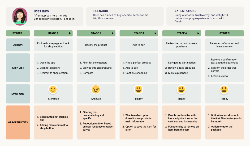
Problem Statement
Beginner campers often feel overwhelmed when trying to choose appropriate camping gear. They face an abundance of unfamiliar products, unclear differences between items, and uncertainty about what equipment is essential. Because of this, many beginners either overspend on unnecessary gear or purchase items that do not fit their needs. There is no simple tool that translates a beginner’s experience level, trip type, and preferences into a personalized list of recommended camping gear. This creates friction, delays, and anxiety during the planning process.
Goal Statement
Design an intuitive camping supply app "Camper" that makes it easy for beginners and casual campers to discover, evaluate, and purchase the right gear for their trip. The app should streamline product selection through a user-friendly survey that generates personalized recommendations, helping users feel confident and prepared while reducing research time and decision fatigue.
Insights
1. Beginners struggle to identify essential gear.
Users felt overwhelmed by endless product lists and weren't sure which items were truly necessary.
2. Product jargon creates confusion.
Technical terms (jargon) intimidated users and reduced confidence in their choices.
3. Users want guidance, not heavy filtering.
A guided, recommendation-based flow was preferred to traditional filter-heavy browsing.
4. Trust improves with clear, simple information.
Users trusted recommendations when they understood the reasoning and saw only relevant details.
5. A clean, distraction-free layout boosts confidence.
Competitor clutter made users feel lost; a simple interface improved clarity and comfort.
DESIGN
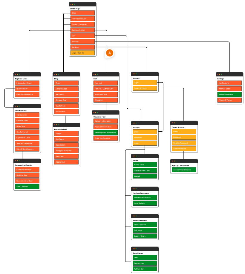
Sitemap
After prioritizing the key features and user goals, I developed the sitemap to show a clear content hierarchy for "Camper". This step helped clarify how users would move through the app, from discovering camping gear to saving favorites, while maintaining a simple and intuitive navigation.
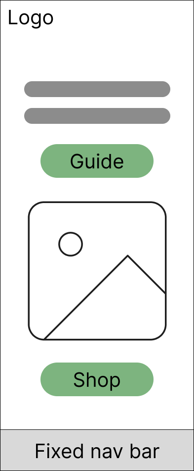
Low-Fidelity Wireframes
I began by sketching paper wireframes to quickly explore layout ideas and core user flows without focusing on visual details. These sketches were then translated into digital low-fidelity wireframes, allowing me to refine structure, hierarchy, and interactions while maintaining flexibility for iteration based on feedback.
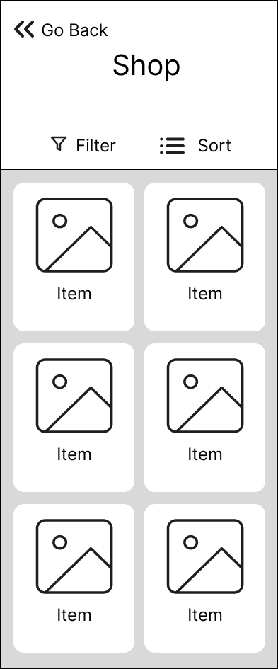
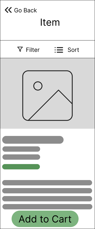

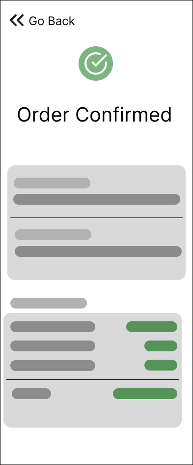
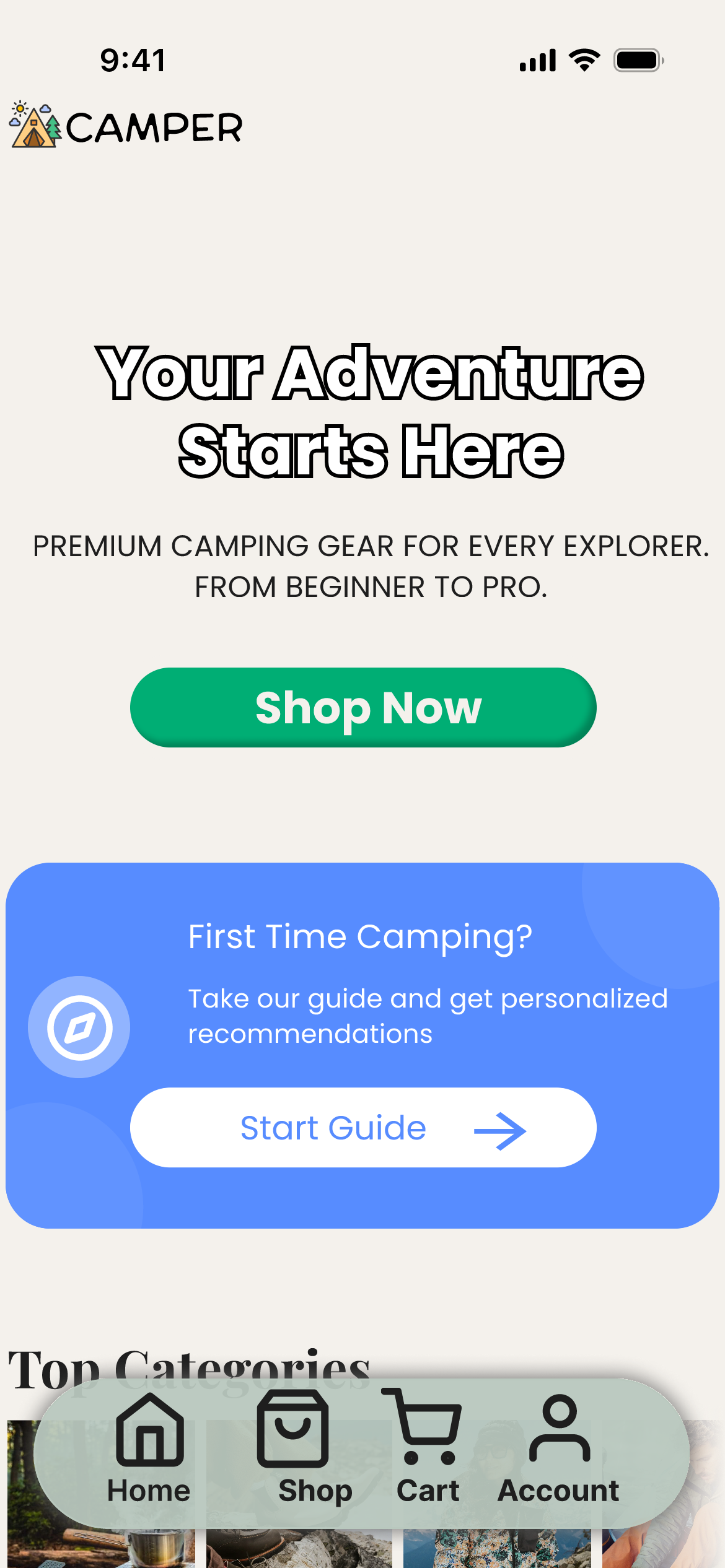
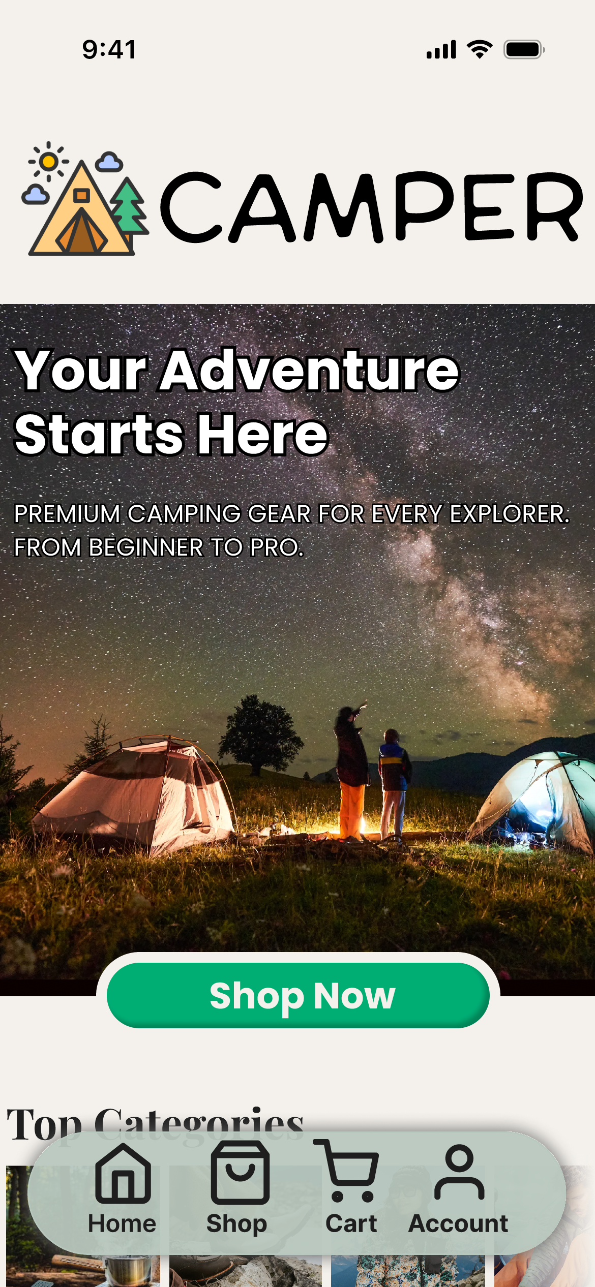
High-Fidelity Mockups
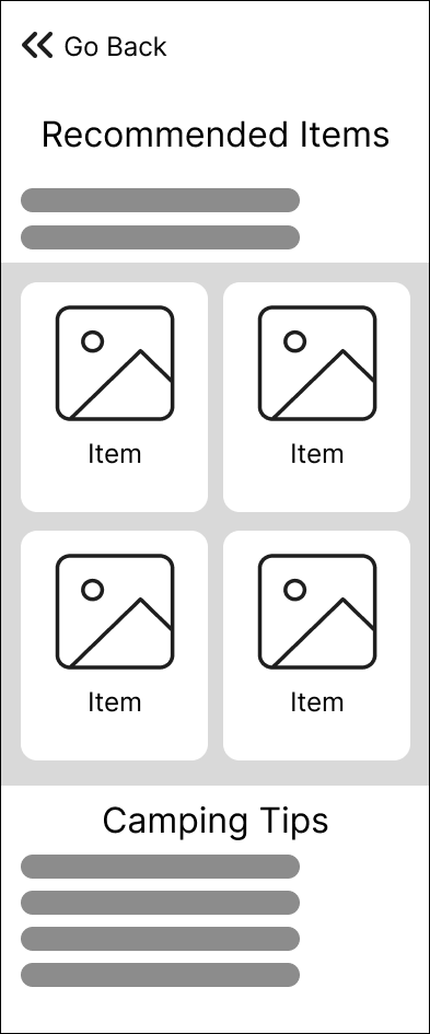
Building on the low-fidelity wireframes, I developed high-fidelity mockups to define the final visual design, interactions, and content hierarchy. This stage focused on consistency, accessibility, and realistic user flows, bringing the concept closer to a production-ready experience.
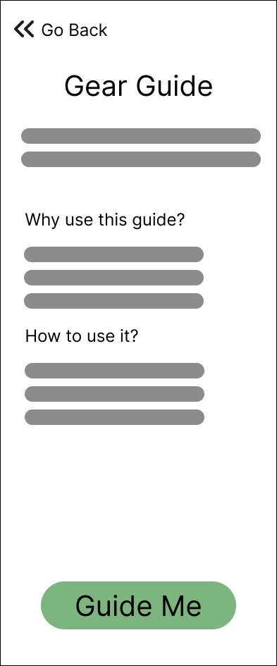
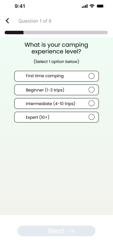
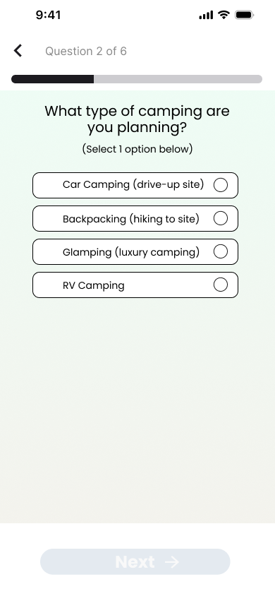
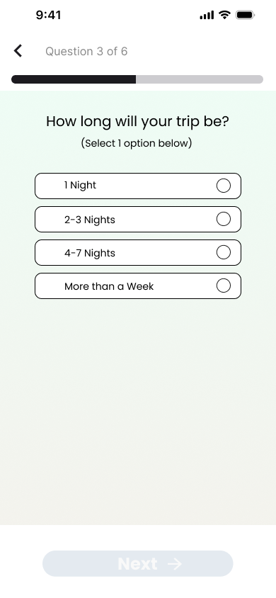
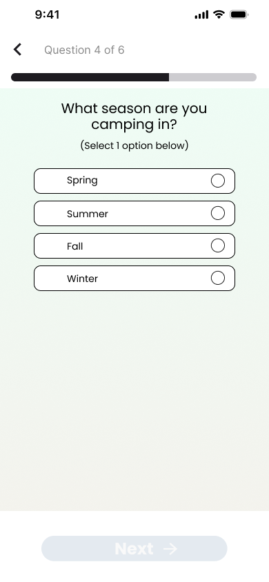
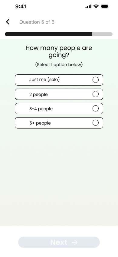
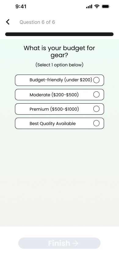
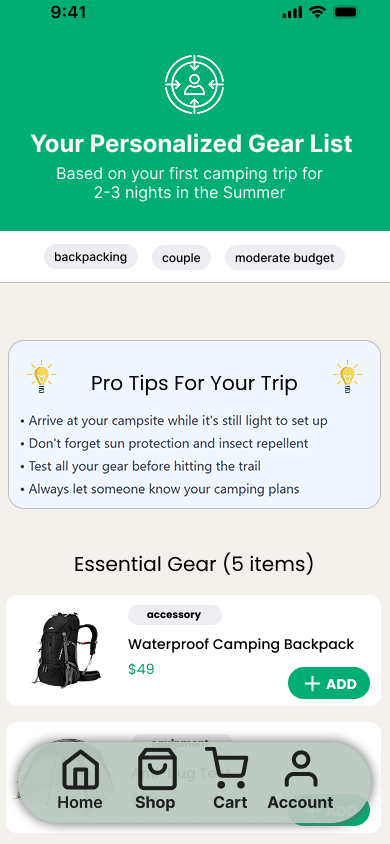
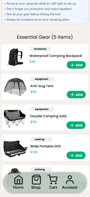
Guide Survey
This survey was included in the Guide section of the app to gather user preferences, needs, and expectations early in the experience. The insights collected helped tailor recommendations and informed key design decisions, ensuring the app aligned with real user goals.
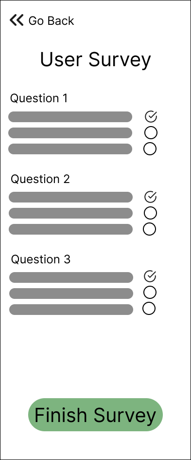
Survey Result
PROTOTYPE
USABILITY TESTING
Objective
The goal of the usability study was to evaluate how easily users can complete key tasks within the camping app, identify usability issues, and validate whether the interface supports users of different experience levels (beginner, intermediate, and expert campers).
Methodology
A moderated usability study was conducted using a clickable prototype. Participants were asked to complete a set of realistic tasks while thinking aloud. Observations, task success rates, and user feedback were recorded.
Metrics to Track
Time on Task: how long it takes for users to complete each task.
Success Rate: whether users can complete each task successfully without assistance.
Error Rate: record any errors or difficulties users experience during the process.
Satisfaction: use a post-task questionnaire to gauge user satisfaction for each task.
Ease of Use: ask participants to rate how easy or difficult the tasks were on a scale from 1 to 5.
Results
Success
(out of 5)
Key Findings
All participants completed the assigned tasks successfully, resulting in a 100% task completion rate, indicating that the core flows were clear and easy to follow.
The average time on task was 51 seconds, suggesting that users were able to navigate and complete tasks quickly without unnecessary friction.
Participants encountered 0% error rate, demonstrating that navigation, labels, and interactions were well understood across experience levels.
Users rated the overall ease of use at 4 out of 5, reflecting high confidence and satisfaction while interacting with the app.
The results suggest that the interface successfully balances guidance for beginners while maintaining efficiency and simplicity for intermediate and expert users.
Conclusion
Usability testing was conducted to evaluate how effectively users could complete key tasks within the camping app and to validate the clarity and efficiency of the interface across different experience levels. Participants successfully completed all assigned tasks using the clickable prototype, providing both quantitative metrics and qualitative feedback. Overall results indicate that the app supports a smooth and intuitive user experience while maintaining accessibility for beginners and efficiency for more experienced campers.
A/B TESTING
Overview
This A/B testing study was conducted for Camper, a travel and camping companion app, to evaluate two design approaches for a key user flow. The study was moderated and remote, conducted via Zoom with screen sharing, allowing me to observe real-time behavior, ask follow-up questions, and capture qualitative insights alongside performance metrics.
My goal with this study was not only to validate a design decision, but also to demonstrate a structured experimentation mindset by defining a problem, forming a hypothesis, testing variants, measuring outcomes, and translating results into clear next steps.
Problem
Early usability feedback indicated that users understood Camper’s purpose but hesitated or slowed down at a critical decision point in the flow.
From my own observations during previous usability sessions, I noticed users paused to re-read content before taking action, some users asked clarifying questions aloud instead of proceeding, the primary call-to-action competed visually with secondary information.
My assumption: the issue was not functionality, but how information hierarchy and CTAs were presented, affecting confidence and speed.
Hypothesis
If the primary action is more visually prominent and supported by clearer contextual guidance, users will complete the task faster and with greater confidence.
Variants
Variant A (Control)
Original layout
Multiple actions visible at once
Presented multiple CTAs at the same level as the primary one
Variant B (Test)
One primary CTA
Supporting information visually grouped
Supported icons with short text to explain their use
Methodology & Steps Taken
1. Participant setup
Conducted moderated sessions over Zoom
Participants shared their screen
I explained that this was a test of the design, not them
2. Task Definition
Gave participants the same realistic task scenario for both variants
Avoided leading language or UI hints
3. A/B Exposure
Participants were shown one variant at a time
Order was alternated across sessions to reduce bias
4. Observation & Probing
I observed cursor movement, hesitation, and verbal reactions
Asked neutral follow-up questions
5. Data Capture
Time to task completion
Errors or mis-clicks
Verbal confidence and clarity cues
Post-task preference and reasoning
Metrics
Quantitative Metrics
Time on task
Task completition rate
Number of hesitations or reversals
Qualitative Metrics
Self reported confidence
Verbal clarity ("this makes sense", "I am not usre what this does")
Preference when asked to compare
Results
Variant A
Users often scanned the screen multiple times before clicking
Took more time to commit to the action
Time on task was almost twice as longer compared to Variant B
Variant B
Performed better overall
Users completed tasks faster with fewer pauses
Participants expressed higher confidence before clicking
Insights
1. Hierarchy builds confidence
Users need a clear and guided path, instead of going for unnecessary options which lead to prolonged time on task
2. Reducing visual competition improves speed
Lowering CTA buttons increases user satisfaction due to faster movement through the app
3. Text supported icons
Inclduing complementary text next to the icon helped users predict outcomes, reducing hesitation
Reflection
This A/B test helped me validate not just a design decision, but my process. Moderated testing allowed me to understand why users behaved the way they did, not just what they did. It reinforced the importance of pairing experimentation with human context, especially early in product development.
PERSONAL REFLECTION
This project strengthened my ability to approach design holistically, from early empathy and research through wireframing, prototyping, and validation. Engaging with users early helped me design with real needs and behaviors in mind rather than assumptions, while iterative wireframes and prototypes allowed me to explore and refine ideas quickly. Usability testing and A/B testing challenged my initial instincts and reinforced the importance of letting evidence guide decisions. Overall, Camper helped me grow more confident in using research to inform design choices and move a product forward with clarity and purpose.